Hello friends, welcome to my today’s post on css3 Button. Today I’m going to show you- How to create, style and animate buttons using only css3. No image, here we are only using simple gradient colors for backgrounds. I hope already you know, css3 has a great power of styling and can produce awesome effects just like flash. More over CSS3 doesn’t require heavy code or image for producing smooth animation. May be only day css3 will take place of Flash. So, lets start today’s tutorial.

Notes:I’ve tested following buttons in all major browsers. But Still IE versions not supports HTML5 and CSS3. Hope, CSS3 and HTML5 will work in IE10.

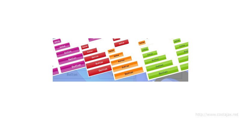
There 5 different color(Simple, Green, Red, Purple, Orange) sets and 5 different sizes(Small, Medium, Large, Xlarge, XXLarge) buttons. You just need to add class name according to your need. Very simple and re-useable classes.

1. Simple CSS3 Button:

Simle CSS3 Button

– CSS Code:

[code] .button-container {
    float: left;
    margin: 10px 10px 10px 10px;
}
.btn{
    font-family: ‘Anaheim’, sans-serif;
    border: 1px solid lightslategray;
    cursor: pointer;
    padding: 5px;
    border-width: 2px;
    border-style: solid;
    border-color: activecaption;    
    -moz-transition: all 0.3s ease-in-out;    
    -webkit-transition: all 0.3s ease-in-out;    
    -o-transition: all 0.3s ease-in-out;    
    -ms-transition: all 0.3s ease-in-out;    
    transition: all 0.3s ease-in-out;    
    color: #000000;
    font-weight: bold;
    box-shadow: 1px 0 1px rgba(0, 0, 0, 0.5);
}

.btn:hover{
    background: lightgray;    
    color: #FFFFFF;
}

.small{
    width: 60px;    
    font-size: 13px;
}

.medium{
    width: 120px;    
    font-size: 15px;
}
.large{
    width: 180px;    
    font-size: 18px;
}

.xlarge{
    width: 220px;    
    font-size: 21px;
}

.xxlarge{
    width: 250px;    
    font-size: 25px;
}

.rounded-corner{
    border-radius: 6px 6px 6px 6px;
}

.cross-rounded-corner{
    border-radius: 0px 6px 0px 6px;
}
[/code]

– HTML Markup:

[code] <div class="button-container">
    <h2>Demo 1</h2>
    <button class="btn small" name="button">Button</button>
    <button class="btn medium" name="button">Button</button>
    <button class="btn large" name="button">Button</button>
    <button class="btn xlarge" name="button">Button</button>
    <button class="btn xxlarge" name="button">Button</button>
</div>
<div class="button-container">
    <h2>Demo 2 Rounded Corner</h2>
    <button class="btn rounded-corner small" name="button">Button</button>
    <button class="btn rounded-corner medium" name="button">Button</button>
    <button class="btn rounded-corner large" name="button">Button</button>
    <button class="btn rounded-corner xlarge" name="button">Button</button>
    <button class="btn rounded-corner xxlarge" name="button">Button</button>
</div>
<div class="button-container">
    <h2>Demo 3 Cross Rounded Corner</h2>
    <button class="btn cross-rounded-corner small" name="button">Button</button>
    <button class="btn cross-rounded-corner medium" name="button">Button</button>
    <button class="btn cross-rounded-corner large" name="button">Button</button>
    <button class="btn cross-rounded-corner xlarge" name="button">Button</button>
    <button class="btn cross-rounded-corner xxlarge" name="button">Button</button>
</div>
[/code]

Demo

2. Green Theme CSS3 Button:

Green Theme CSS3 Button

– CSS Code:

[code] .theme-green{
    background: rgb(157,213,58);
    background: -moz-linear-gradient(top,  rgba(157,213,58,1) 0%, rgba(161,213,79,1) 50%, rgba(128,194,23,1) 51%, rgba(124,188,10,1) 100%);
    background: -webkit-gradient(linear, left top, left bottom, color-stop(0%,rgba(157,213,58,1)), color-stop(50%,rgba(161,213,79,1)), color-stop(51%,rgba(128,194,23,1)), color-stop(100%,rgba(124,188,10,1)));
    background: -webkit-linear-gradient(top,  rgba(157,213,58,1) 0%,rgba(161,213,79,1) 50%,rgba(128,194,23,1) 51%,rgba(124,188,10,1) 100%);
    background: -o-linear-gradient(top,  rgba(157,213,58,1) 0%,rgba(161,213,79,1) 50%,rgba(128,194,23,1) 51%,rgba(124,188,10,1) 100%);
    background: -ms-linear-gradient(top,  rgba(157,213,58,1) 0%,rgba(161,213,79,1) 50%,rgba(128,194,23,1) 51%,rgba(124,188,10,1) 100%);
    background: linear-gradient(to bottom,  rgba(157,213,58,1) 0%,rgba(161,213,79,1) 50%,rgba(128,194,23,1) 51%,rgba(124,188,10,1) 100%);
    filter: progid:DXImageTransform.Microsoft.gradient( startColorstr=’#9dd53a’, endColorstr=’#7cbc0a’,GradientType=0 );    
    color: #394f5f;    
    border: 2px solid #9fd549;
    box-shadow: 1px 1px 1px rgba(240,240,240,0.2) inset;
}

.theme-green:hover{    
    background: rgb(124,188,10);
    background: -moz-linear-gradient(top,  rgba(124,188,10,1) 0%, rgba(128,194,23,1) 53%, rgba(161,213,79,1) 55%, rgba(157,213,58,1) 100%);
    background: -webkit-gradient(linear, left top, left bottom, color-stop(0%,rgba(124,188,10,1)), color-stop(53%,rgba(128,194,23,1)), color-stop(55%,rgba(161,213,79,1)), color-stop(100%,rgba(157,213,58,1)));
    background: -webkit-linear-gradient(top,  rgba(124,188,10,1) 0%,rgba(128,194,23,1) 53%,rgba(161,213,79,1) 55%,rgba(157,213,58,1) 100%);
    background: -o-linear-gradient(top,  rgba(124,188,10,1) 0%,rgba(128,194,23,1) 53%,rgba(161,213,79,1) 55%,rgba(157,213,58,1) 100%);
    background: -ms-linear-gradient(top,  rgba(124,188,10,1) 0%,rgba(128,194,23,1) 53%,rgba(161,213,79,1) 55%,rgba(157,213,58,1) 100%);
    background: linear-gradient(to bottom,  rgba(124,188,10,1) 0%,rgba(128,194,23,1) 53%,rgba(161,213,79,1) 55%,rgba(157,213,58,1) 100%);
    filter: progid:DXImageTransform.Microsoft.gradient( startColorstr=’#7cbc0a’, endColorstr=’#9dd53a’,GradientType=0 );    
    color: #f6efc9;
    border: 2px solid #7dbd0d;
    box-shadow: 1px 1px 1px rgba(255,255,255,0.6) inset;    
}
[/code]

– HTML Markup:

[code] <div class="button-container">
    <h2>Demo 1(Green Theme)</h2>
    <button class="btn small theme-green" name="button">Button</button>
    <button class="btn medium theme-green" name="button">Button</button>
    <button class="btn large theme-green" name="button">Button</button>
    <button class="btn xlarge theme-green" name="button">Button</button>
    <button class="btn xxlarge theme-green" name="button">Button</button>
</div>

<div class="button-container">
    <h2>Demo 2(Green Theme)</h2>
    <button class="btn rounded-corner small theme-green" name="button">Button</button>
    <button class="btn rounded-corner medium theme-green" name="button">Button</button>
    <button class="btn rounded-corner large theme-green" name="button">Button</button>
    <button class="btn rounded-corner xlarge theme-green" name="button">Button</button>
    <button class="btn rounded-corner xxlarge theme-green" name="button">Button</button>
</div>

<div class="button-container">
    <h2>Demo 3 Cross Rounded Corner(Green Theme)</h2>
    <button class="btn cross-rounded-corner small theme-green" name="button">Button</button>
    <button class="btn cross-rounded-corner medium theme-green" name="button">Button</button>
    <button class="btn cross-rounded-corner large theme-green" name="button">Button</button>
    <button class="btn cross-rounded-corner xlarge theme-green" name="button">Button</button>
    <button class="btn cross-rounded-corner xxlarge theme-green" name="button">Button</button>
</div>
[/code]

Demo

3. Red Theme CSS3 Button:

Red Theme CSS3 Buttons

– CSS Code:

[code] .theme-red{
    background: rgb(221,73,73);
    background: -moz-linear-gradient(top,  rgba(221,73,73,1) 0%, rgba(206,51,59,1) 49%, rgba(209,4,17,1) 100%);
    background: -webkit-gradient(linear, left top, left bottom, color-stop(0%,rgba(221,73,73,1)), color-stop(49%,rgba(206,51,59,1)), color-stop(100%,rgba(209,4,17,1)));
    background: -webkit-linear-gradient(top,  rgba(221,73,73,1) 0%,rgba(206,51,59,1) 49%,rgba(209,4,17,1) 100%);
    background: -o-linear-gradient(top,  rgba(221,73,73,1) 0%,rgba(206,51,59,1) 49%,rgba(209,4,17,1) 100%);
    background: -ms-linear-gradient(top,  rgba(221,73,73,1) 0%,rgba(206,51,59,1) 49%,rgba(209,4,17,1) 100%);
    background: linear-gradient(to bottom,  rgba(221,73,73,1) 0%,rgba(206,51,59,1) 49%,rgba(209,4,17,1) 100%);
    filter: progid:DXImageTransform.Microsoft.gradient( startColorstr=’#dd4949′, endColorstr=’#d10411′,GradientType=0 );    
    color: #FFFFFF;    
    border: 2px solid #9e344b;
    box-shadow: 1px 1px 1px rgba(240,240,240,0.2) inset;
}

.theme-red:hover{    
    background: rgb(209,4,17);
    background: -moz-linear-gradient(top,  rgba(209,4,17,1) 0%, rgba(206,51,59,1) 51%, rgba(221,73,73,1) 100%);
    background: -webkit-gradient(linear, left top, left bottom, color-stop(0%,rgba(209,4,17,1)), color-stop(51%,rgba(206,51,59,1)), color-stop(100%,rgba(221,73,73,1)));
    background: -webkit-linear-gradient(top,  rgba(209,4,17,1) 0%,rgba(206,51,59,1) 51%,rgba(221,73,73,1) 100%);
    background: -o-linear-gradient(top,  rgba(209,4,17,1) 0%,rgba(206,51,59,1) 51%,rgba(221,73,73,1) 100%);
    background: -ms-linear-gradient(top,  rgba(209,4,17,1) 0%,rgba(206,51,59,1) 51%,rgba(221,73,73,1) 100%);
    background: linear-gradient(to bottom,  rgba(209,4,17,1) 0%,rgba(206,51,59,1) 51%,rgba(221,73,73,1) 100%);
    filter: progid:DXImageTransform.Microsoft.gradient( startColorstr=’#d10411′, endColorstr=’#dd4949′,GradientType=0 );    
    color: #000000;
    border: 2px solid brown;
    box-shadow: 1px 1px 1px rgba(255,255,255,0.6) inset;    
}
[/code]

– HTML Markup:

[code] <div class="button-container">
    <h2>Demo 1(Red Theme)</h2>
    <button class="btn small theme-red" name="button">Button</button>
    <button class="btn medium theme-red" name="button">Button</button>
    <button class="btn large theme-red" name="button">Button</button>
    <button class="btn xlarge theme-red" name="button">Button</button>
    <button class="btn xxlarge theme-red" name="button">Button</button>
</div>

<div class="button-container">
    <h2>Demo 2(Red Theme)</h2>
    <button class="btn rounded-corner small theme-red" name="button">Button</button>
    <button class="btn rounded-corner medium theme-red" name="button">Button</button>
    <button class="btn rounded-corner large theme-red" name="button">Button</button>
    <button class="btn rounded-corner xlarge theme-red" name="button">Button</button>
    <button class="btn rounded-corner xxlarge theme-red" name="button">Button</button>
</div>

<div class="button-container">
    <h2>Demo 3 Cross Rounded Corner (Red Theme)</h2>
    <button class="btn cross-rounded-corner small theme-red" name="button">Button</button>
    <button class="btn cross-rounded-corner medium theme-red" name="button">Button</button>
    <button class="btn cross-rounded-corner large theme-red" name="button">Button</button>
    <button class="btn cross-rounded-corner xlarge theme-red" name="button">Button</button>
    <button class="btn cross-rounded-corner xxlarge theme-red" name="button">Button</button>
</div>
[/code]


Demo

4. Purple Theme CSS3 Button:

Purple Theme CSS3 Button

– CSS Code:

[code]
.theme-purple{    
    background: rgb(219,54,164);
    background: -moz-linear-gradient(top,  rgba(219,54,164,1) 0%, rgba(168,0,119,1) 49%, rgba(193,70,161,1) 50%, rgba(203,96,179,1) 100%);
    background: -webkit-gradient(linear, left top, left bottom, color-stop(0%,rgba(219,54,164,1)), color-stop(49%,rgba(168,0,119,1)), color-stop(50%,rgba(193,70,161,1)), color-stop(100%,rgba(203,96,179,1)));
    background: -webkit-linear-gradient(top,  rgba(219,54,164,1) 0%,rgba(168,0,119,1) 49%,rgba(193,70,161,1) 50%,rgba(203,96,179,1) 100%);
    background: -o-linear-gradient(top,  rgba(219,54,164,1) 0%,rgba(168,0,119,1) 49%,rgba(193,70,161,1) 50%,rgba(203,96,179,1) 100%);
    background: -ms-linear-gradient(top,  rgba(219,54,164,1) 0%,rgba(168,0,119,1) 49%,rgba(193,70,161,1) 50%,rgba(203,96,179,1) 100%);
    background: linear-gradient(to bottom,  rgba(219,54,164,1) 0%,rgba(168,0,119,1) 49%,rgba(193,70,161,1) 50%,rgba(203,96,179,1) 100%);
    filter: progid:DXImageTransform.Microsoft.gradient( startColorstr=’#db36a4′, endColorstr=’#cb60b3′,GradientType=0 );
    color: #ffffff;    
    border: 2px solid #c31c8e;
    box-shadow: 1px 1px 1px rgba(240,240,240,0.2) inset;
}

.theme-purple:hover{    
    background: rgb(203,96,179);
    background: -moz-linear-gradient(top,  rgba(203,96,179,1) 0%, rgba(193,70,161,1) 50%, rgba(168,0,119,1) 51%, rgba(219,54,164,1) 100%);
    background: -webkit-gradient(linear, left top, left bottom, color-stop(0%,rgba(203,96,179,1)), color-stop(50%,rgba(193,70,161,1)), color-stop(51%,rgba(168,0,119,1)), color-stop(100%,rgba(219,54,164,1)));
    background: -webkit-linear-gradient(top,  rgba(203,96,179,1) 0%,rgba(193,70,161,1) 50%,rgba(168,0,119,1) 51%,rgba(219,54,164,1) 100%);
    background: -o-linear-gradient(top,  rgba(203,96,179,1) 0%,rgba(193,70,161,1) 50%,rgba(168,0,119,1) 51%,rgba(219,54,164,1) 100%);
    background: -ms-linear-gradient(top,  rgba(203,96,179,1) 0%,rgba(193,70,161,1) 50%,rgba(168,0,119,1) 51%,rgba(219,54,164,1) 100%);
    background: linear-gradient(to bottom,  rgba(203,96,179,1) 0%,rgba(193,70,161,1) 50%,rgba(168,0,119,1) 51%,rgba(219,54,164,1) 100%);
    filter: progid:DXImageTransform.Microsoft.gradient( startColorstr=’#cb60b3′, endColorstr=’#db36a4′,GradientType=0 );    
    color: #000000;
    border: 2px solid #c859ae;
    box-shadow: 1px 1px 1px rgba(255,255,255,0.6) inset;    
}
[/code]

– HTML Markup:

[code] <div class="button-container">
    <h2>Demo 1(Purple Theme)</h2>
    <button class="btn small theme-purple" name="button">Button</button>
    <button class="btn medium theme-purple" name="button">Button</button>
    <button class="btn large theme-purple" name="button">Button</button>
    <button class="btn xlarge theme-purple" name="button">Button</button>
    <button class="btn xxlarge theme-purple" name="button">Button</button>
</div>

<div class="button-container">
    <h2>Demo 2(Purple Theme)</h2>
    <button class="btn rounded-corner small theme-purple" name="button">Button</button>
    <button class="btn rounded-corner medium theme-purple" name="button">Button</button>
    <button class="btn rounded-corner large theme-purple" name="button">Button</button>
    <button class="btn rounded-corner xlarge theme-purple" name="button">Button</button>
    <button class="btn rounded-corner xxlarge theme-purple" name="button">Button</button>
</div>

<div class="button-container">
    <h2>Demo 3 Cross Rounded Corner (Purple Theme)</h2>
    <button class="btn cross-rounded-corner small theme-purple" name="button">Button</button>
    <button class="btn cross-rounded-corner medium theme-purple" name="button">Button</button>
    <button class="btn cross-rounded-corner large theme-purple" name="button">Button</button>
    <button class="btn cross-rounded-corner xlarge theme-purple" name="button">Button</button>
    <button class="btn cross-rounded-corner xxlarge theme-purple" name="button">Button</button>
</div>
[/code]

Demo

5. Orange Theme CSS3 Button:

Orange Theme CSS3 Button

– CSS Code:

[code]
.theme-orange{
    background: rgb(255,127,4);
    background: -moz-linear-gradient(top,  rgba(255,127,4,1) 0%, rgba(255,124,0,1) 49%, rgba(255,167,61,1) 50%, rgba(255,183,107,1) 100%);
    background: -webkit-gradient(linear, left top, left bottom, color-stop(0%,rgba(255,127,4,1)), color-stop(49%,rgba(255,124,0,1)), color-stop(50%,rgba(255,167,61,1)), color-stop(100%,rgba(255,183,107,1)));
    background: -webkit-linear-gradient(top,  rgba(255,127,4,1) 0%,rgba(255,124,0,1) 49%,rgba(255,167,61,1) 50%,rgba(255,183,107,1) 100%);
    background: -o-linear-gradient(top,  rgba(255,127,4,1) 0%,rgba(255,124,0,1) 49%,rgba(255,167,61,1) 50%,rgba(255,183,107,1) 100%);
    background: -ms-linear-gradient(top,  rgba(255,127,4,1) 0%,rgba(255,124,0,1) 49%,rgba(255,167,61,1) 50%,rgba(255,183,107,1) 100%);
    background: linear-gradient(to bottom,  rgba(255,127,4,1) 0%,rgba(255,124,0,1) 49%,rgba(255,167,61,1) 50%,rgba(255,183,107,1) 100%);
    filter: progid:DXImageTransform.Microsoft.gradient( startColorstr=’#ff7f04′, endColorstr=’#ffb76b’,GradientType=0 );
    color: #000000;    
    border: 2px solid #ffb25c;
    box-shadow: 1px 1px 1px rgba(240,240,240,0.2) inset;
}

.theme-orange:hover{    
    background: rgb(255,183,107);
    background: -moz-linear-gradient(top,  rgba(255,183,107,1) 0%, rgba(255,167,61,1) 50%, rgba(255,124,0,1) 51%, rgba(255,127,4,1) 100%);
    background: -webkit-gradient(linear, left top, left bottom, color-stop(0%,rgba(255,183,107,1)), color-stop(50%,rgba(255,167,61,1)), color-stop(51%,rgba(255,124,0,1)), color-stop(100%,rgba(255,127,4,1)));
    background: -webkit-linear-gradient(top,  rgba(255,183,107,1) 0%,rgba(255,167,61,1) 50%,rgba(255,124,0,1) 51%,rgba(255,127,4,1) 100%);
    background: -o-linear-gradient(top,  rgba(255,183,107,1) 0%,rgba(255,167,61,1) 50%,rgba(255,124,0,1) 51%,rgba(255,127,4,1) 100%);
    background: -ms-linear-gradient(top,  rgba(255,183,107,1) 0%,rgba(255,167,61,1) 50%,rgba(255,124,0,1) 51%,rgba(255,127,4,1) 100%);
    background: linear-gradient(to bottom,  rgba(255,183,107,1) 0%,rgba(255,167,61,1) 50%,rgba(255,124,0,1) 51%,rgba(255,127,4,1) 100%);
    filter: progid:DXImageTransform.Microsoft.gradient( startColorstr=’#ffb76b’, endColorstr=’#ff7f04′,GradientType=0 );    
    color: #f6efc9;
    border: 2px solid #ff7e02;
    box-shadow: 1px 1px 1px rgba(255,255,255,0.6) inset;    
}
[/code]

– HTML Markup:

[code] <div class="button-container">
    <h2>Demo 1(Orange Theme)</h2>
    <button class="btn small theme-orange" name="button">Button</button>
    <button class="btn medium theme-orange" name="button">Button</button>
    <button class="btn large theme-orange" name="button">Button</button>
    <button class="btn xlarge theme-orange" name="button">Button</button>
    <button class="btn xxlarge theme-orange" name="button">Button</button>
</div>

<div class="button-container">
    <h2>Demo 2(Orange Theme)</h2>
    <button class="btn rounded-corner small theme-orange" name="button">Button</button>
    <button class="btn rounded-corner medium theme-orange" name="button">Button</button>
    <button class="btn rounded-corner large theme-orange" name="button">Button</button>
    <button class="btn rounded-corner xlarge theme-orange" name="button">Button</button>
    <button class="btn rounded-corner xxlarge theme-orange" name="button">Button</button>
</div>

<div class="button-container">
    <h2>Demo 3 Cross Rounded Corner(Orange Theme)</h2>
    <button class="btn cross-rounded-corner small theme-orange" name="button">Button</button>
    <button class="btn cross-rounded-corner medium theme-orange" name="button">Button</button>
    <button class="btn cross-rounded-corner large theme-orange" name="button">Button</button>
    <button class="btn cross-rounded-corner xlarge theme-orange" name="button">Button</button>
    <button class="btn cross-rounded-corner xxlarge theme-orange" name="button">Button</button>
</div>
[/code]


Demo

Download All Buttons

Was this information useful? What other tips would you like to read about in the future? Share your comments, feedback and experiences with us by commenting below!

,

Leave a Comment

Your email address will not be published. Required fields are marked *

*
*

Back To Top